 Figure 5 |
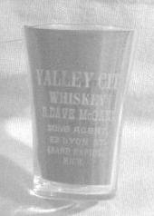 Figure 6 |
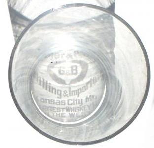 Figure 7 |
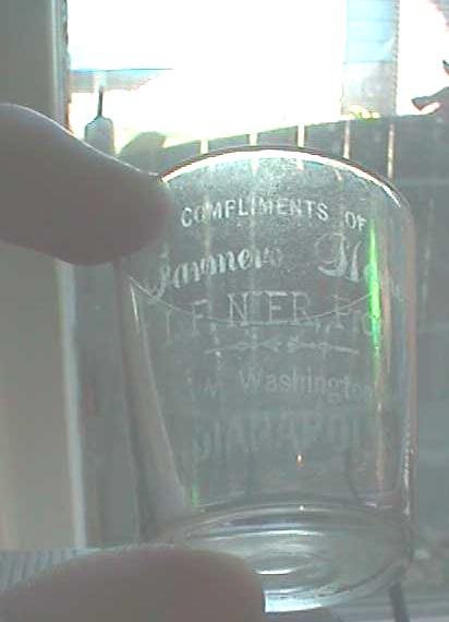 Figure 8 |
Too light, too dark
Included in the “obvious in the viewfinder” category are lighting extremes. The
first example is an image so dark that it’s difficult to discern that the
subject is actually a shot glass, let alone that it's a valuable Peoria picture glass
[Figure 5].
Digital cameras automatically adjust exposure time to compensate for ambient light
levels but, as a general
rule, if you can’t read the label when looking at the glass through the
viewfinder or view screen, then you're unlikely to be able create
a successful image.
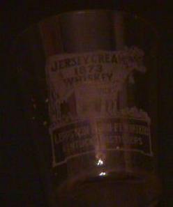
At the opposite extreme is the example shown in Figure 6. Again, digital
cameras are adept at responding to light extremes, but the label on this Valley City glass
is so bleached by light and background glare that it’s difficult to make out the
city of origin.
|
Figure 5 |
Figure 6 |
|
Figure 7 |
Figure 8 |
Figure 7 shows a glass photographed in direct sunlight but now the lens is pointing straight down into the mouth of a glass
that's standing on a white background. The light is so intense and
directional that it creates a shadow of the label that is sufficiently crisp that it appears to be etched
in the base! The photographer gets full marks
for creativity and composition, but what are we to conclude about the condition of
the glass or label? It’s difficult to deduce anything other than the fact
that it comes from Kansas City.
A final example of light excess is shown in Figure 8. Although the
photographer was working indoors, the glass was proffered before a brightly-light window and the lens
aimed directly
up at the glass and into the sun. The camera optics are overwhelmed by light and the resultant image is marred by stupefying glare.
So far we’ve dealt with basic errors in photographic technique that literally scream at
the viewer from the page. In the next sections we’ll look at changes in lighting and camera position that
are relatively subtle yet have a substantial and detrimental effect on the resultant image.
Contrast, contrast, contrast.
A photographer faces two major challenges when trying to create memorable and
compelling images of their shots. The first is the tendency
of glass to concentrate and reflect back strong images of anything in close
proximity. The other is the issue of how to make an etched inscription stand out
clearly against the background. Given that the inscriptions on pre-pro glasses fade with handling, many have been thinned significantly in
the century or so since they were minted. Trying to capture them on film can thus
be as challenging as stalking a ghost.
Most pre-pro glasses were branded with a white label so it
follows that if we wish to make the etching stand out clearly we choose a dark,
contrasting background. Yet "white-on-white" syndrome is one of the commonest
photographic ailments encountered on eBay. Two prime examples are shown in
Figures 9 and
10. On the left we have a Cuckoo Whiskey from Boston, on the
right a Hayner Lockbox 290. Both glasses feature prominently in many collections
where they're prized for the intricacy of their etching.
But would you want to bid on either of the glasses shown here without being able to
determine the content and condition of the label? Probably not.
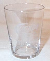 Figure 9 |
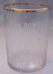 Figure 10 |
Figure 11 |
Figure 2 was taken from a recent auction in which the seller
decided to cover the rich, contrasty table upon which the glass
is sitting with a white crocheted fabric. Any idea where this glass comes from?
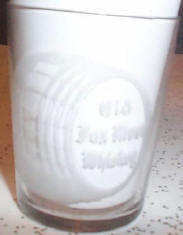
Figure 11 shows an Old Fox River glass nestled on a kitchen countertop. The
photographer realized that white-on-white was a problem and hence inserted a
piece of paper to provide contrast. Unfortunately it's also white and the label
melts into the background.
[ Turn Back a Page ] [ Back to Random Shots Index ] [ Turn to Next Page ]